List Menu
Description
A customizable menu that renders as a list of choices.
Discussion
The List Menu is a pre-defined control that displays a list of menu options. When clicked, each item in the menu triggers an action. Actions are implemented using JavaScript and can be customized to perform any desired action, including executing Action Javascript.
List menus are a common pattern found in mobile apps. The menu is often displayed as an animated panel that slides into view from the side of the screen. This panel can be configured to automatically hide after the user makes a selection, or remain open until the user performs an action to hide the panel.
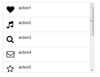
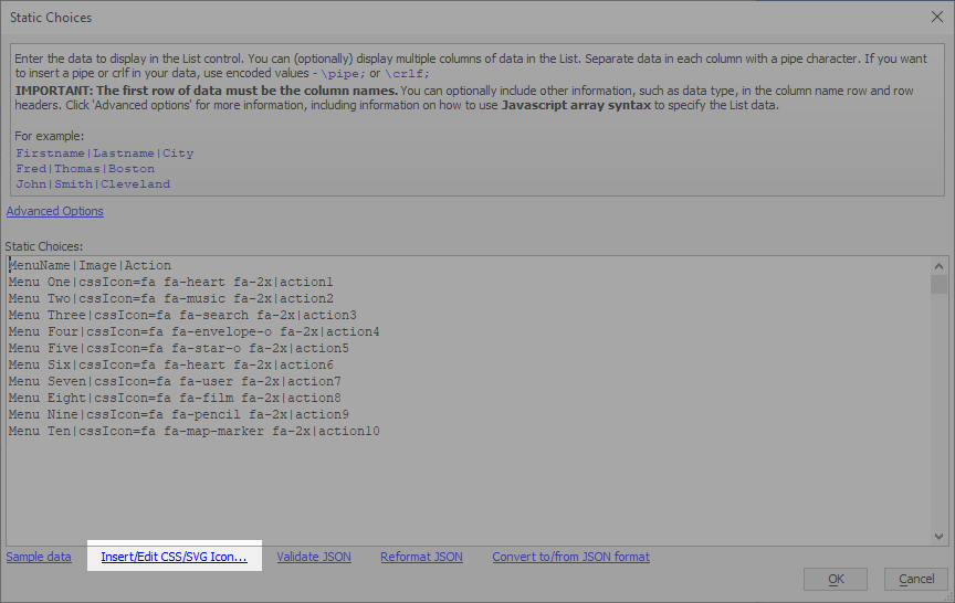
The List Menu control includes then menu options, defined as static choices on the Data Source tab in the List Builder:
MenuName|Image|Action
Menu One|cssIcon=fa fa-heart fa-2x|action1
Menu Two|cssIcon=fa fa-music fa-2x|action2
Menu Three|cssIcon=fa fa-search fa-2x|action3
Menu Four|cssIcon=fa fa-envelope-o fa-2x|action4
Menu Five|cssIcon=fa fa-star-o fa-2x|action5
Menu Six|cssIcon=fa fa-heart fa-2x|action6
Menu Seven|cssIcon=fa fa-user fa-2x|action7
Menu Eight|cssIcon=fa fa-film fa-2x|action8
Menu Nine|cssIcon=fa fa-pencil fa-2x|action9
Menu Ten|cssIcon=fa fa-map-marker fa-2x|action10
Each menu option in the static data defines three items: the text to show in the menu (MenuName), the CSS Icon to display next to the text (Image), and text that is shown in a popup when the menu item is clicked (Action).
The code that displays the popup can be found in the List's onClick event. It contains a single alert() statement that displays the Action for the selected List row:
alert(this.selectionData[0].Action);
Modify the onClick event to add your own logic for the menu items. You can use the Action to identify which menu option was selected. When used with a JavaScript switch statement, you can identify which action was selected and execute specific code for the menu option:
var selectedAction = this.selectionData[0].Action

switch (selectedAction) {
case 'action1':
    var iconName = this.selectionData[0].Image;
    alert("Menu option 1 uses the '"+iconName+"' css icon.");
    break;
case 'action2':
    alert("The second menu item has been clicked.");
    break;
default:
    alert(selectedAction + " isn't implemented yet!");
}
The icon for the menu option is created by configuring the Image field as a "CSSIcon" Control type (on the Fields tab.) The value of the Image field will be interpreted as a CSS icon by Alpha Anywhere when this type is used. The List Menu specifies icons from the Font Awesome CSS font. This font is included in the installation of Alpha Anywhere.
The CSSIcon field type also supports SVG icon. You can use any SVG icon system SVG icon included in your project. Use the Insert/Edit CSS/SVG icon... link at the bottom of the Static Choices dialog to insert or modify a CSS or SVG icon.
Videos
Using CSS Icons in a List - List Menus
A common pattern in mobile applications is to use a List control as the menu. This list control is then displayed in a Panel Window that animates in from the left side of the screen. Icons are typically displayed for each menu choice. CSS Icons are ideal for these types of icons. In this video we show how a List can be easily configured to display a menu. Each item in the List has a CSS Icon in it.
See Also